Dear woot gods, you’re killin’ me… scrambles off to work on ideas
I hate text shirts.
Yeah, you really need to work on those…
lol… well that last one sure isn’t selling. Do all you other artists feel guilt when your shirts tank?
(I feel ok enough to take the check woot.)
What exactly would you be guilty of? You subbed a clever shirt, people voted it to the top and then didn’t buy it. I fail to see where you did anything wrong, unless this was your evil plan all along.
HAHAHA… yeah. I feel guilt when my shirt tanks for one reason or another.
And what sucks, is that text/slogan tees are a horrible weak point for me. I can draw fine. My text tees simply fall flat.
Uuuuh, I might already have something for this ![]() http://ow.ly/yKSO9
http://ow.ly/yKSO9
Well, I didn’t really mean that I WAS guilty of anything… but I can’t help but feel bad about poor sales.
Well, the one thing about both my winning slogan shirts, is I slipped them through in normal derbies. Coming up with a winning slogan while surrounded by other slogans has to be much much harder. I’m leaning on going the text as art route.
Ugh, me too.
“It’s not a party unless you invite the whole world” from the book/movie “The Kite Runner”:
Need some space between “you” “invite” “the” for legibility.
Not enough contrast between the orange ribbon and the blue background, might use a drop shadow.
I would add the title of the book or movie before or after the author.
My tall designs get squashed into a square when I upload. I hope you can avoid that.
You are way ahead of some of us!
WHY never any cream tees? You sell them. Why not have them in Derby’s?
Wow, man thanks for the awesome feedback ![]()
Supplier issues.
Since it’s already for sale elsewhere, you would need to make some serious revisions before submitting it here. Woot (usually) is all jealous about that.
I know, I know, I’m starting to work on that ![]()

Hah!
I’m thinking water. Baby blue looks good.
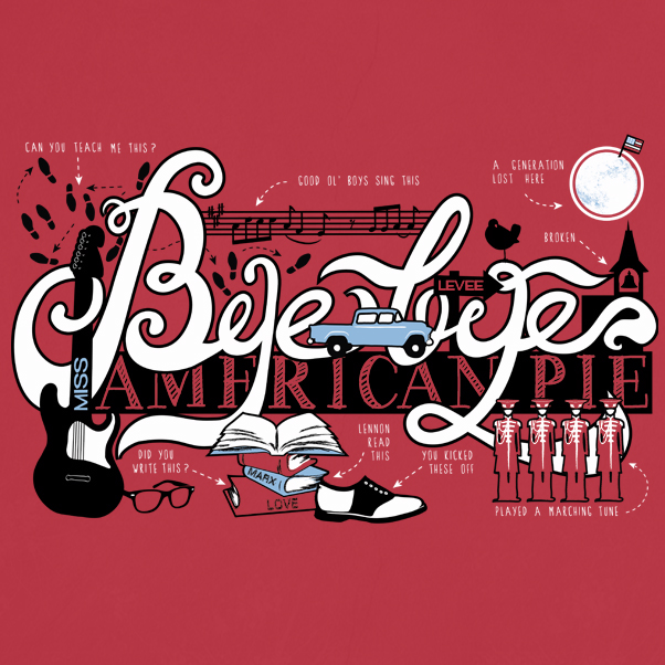
Well, I certainly do a lot of texty things (like my American Pie design from a few weeks ago). Would that style work for this Derby? It’s not exactly a slogan, but it certainly focuses on text.
Awesome! Got a few ideas already.